Pantone Just Released a Period-Colored Paint and We’re Here for It
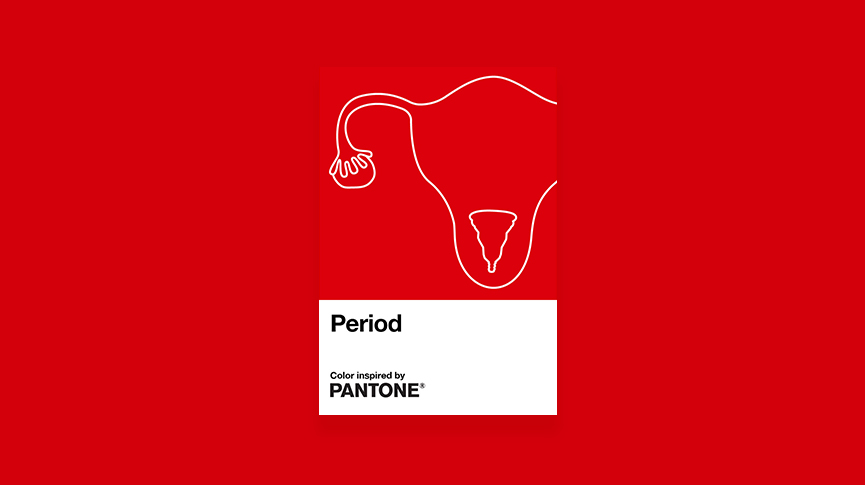
What do you get when you combine an intimate healthcare brand with a paint company? Period blood color, the perfect shade to represent periods. The Pantone Colour Institute just partnered with INTIMINA to release a custom Pantone red color to represent menstruation. We aren’t just painting walls, we’re breaking down the ones that contribute to the stigmas surrounding periods.
It may be the 21st century, but attitudes around menstruation are long outdated and preserved by perpetuated cultural taboos that are mysterious, shameful, and the butt of many jokes.
As part of a new campaign by INTIMINA to make menstruation more visible and normalize this most normal of bodily functions, The Pantone Colour Institute has created Period—an original shade of red that represents a steady flow during menstruation.
The color Period is an energizing and dynamic red shade that serves as the banner for INTIMINA’s ‘Seen+Heard’ campaign, which is designed to empower and encourage everyone, regardless of gender, to have more accurate and honest conversations around menstruation.
Danela Žagar, Intimina Global Brand Manager, says:
Despite the fact that billions of people experience menstruation, it has historically been treated as something that shouldn’t be seen or talked about publicly. And if we look at popular culture, depictions of periods have ranged from wildly inaccurate and unsympathetic to being the subject of jokes and derision.
Enough is enough, it’s 2020. Isn’t it time periods stop being considered as a private affair or a negative experience? Isn’t it time we call out people that try to perpetuate the stigma surrounding periods? Or those that mock it? Isn’t it time we come together to encourage period positivity and make sure periods are seen and heard?
That’s what we aim to do with our campaign and it’s been brilliant to have The Pantone Color Institute lend their support as we launch it by creating an original red colour emblematic of a steady flow during menstruation.
Pantone’s ‘Period’ red shade represents exactly what our Seen+Heard campaign is about: making periods visible, encouraging positive conversations and normalising menstruation in our culture, our society and in our everyday lives.
Laurie Pressman, Vice-President Pantone Color Institute from Pantone, comments:
We were very honoured to partner with Intimina on the creation of Period, a confident red shade symbolic of the empowering message expressed in their new Seen + Heard campaign. An active and adventurous red hue, courageous Period emboldens people who menstruate to feel proud of who they are.
To own their period with self-assurance; to stand up and passionately celebrate the exciting and powerful life force they are born with; to urge everyone regardless of gender to feel comfortable to talk spontaneously and openly about this pure and natural bodily function.
Not only has the Seen+Heard campaign helped normalize conversations surrounding menstruation, INTIMINA has also donated £2,000 to ActionAid, an international charity that works with women and girls living in poverty.
Jillian Popkins, Director of Policy, Advocacy, and Programmes from ActionAid UK, says:
This is a fantastic campaign and a badly needed one. Around the world today, millions of women and girls still suffer due to the stigma associated with periods.
Many girls miss vital days of school, or even drop out altogether, which is one reason so many women experience life-long poverty globally.
Without the stigma around periods, more women could escape poverty, fulfil their potential and strengthen their communities. This important campaign will help change that.
A collective group of “lady experts” at Intimina who love sharing our personal experiences, even when they are a little too personal. We believe it’s time to start breaking down the taboos around menstruation, motherhood, and menopause, and start owning our female health.